Disney+ has just delivered the trailer for The French Dispatch.
Wandering off-topic: spelling clarification from around the internet.
“There is no difference between dispatch and despatch. … Despatch has mostly disappeared from the language—except in the U.K., where it appears in place of dispatch about a third of the time—and dispatch is the preferred spelling for all senses of the word.”
“Despatch is the British variant of the term. Conversely, “dispatch” is the American version, and it retains the standard form used since the 1500s.”
“Meanwhile, “dispatch” is the American version of “despatch.” This version is more popular, more commonly used, and regarded as the correct spelling of the word.”
“It is common for us, when we have two words for the same thing, to make one mean something slightly different from the other. So dispatch becomes the noun meaning ‘speed and energy’ and despatch becomes the verb meaning ‘to send off with speed and energy’.”
Symmetry and block colours, often yellows, blues, red are elements of his distinct style. The Grand Budapest Hotel building is symmetrical, as are the promotional images for The Darjeeling Limited, The Life Aquatic and Isle of Dogs. Photo-shots of the cast of characters are often lined up in a way that is specific to Wes Anderson films – all facing front, like a group wedding photograph: The Darjeeling Limited, The Life Aquatic, Isle of Dogs, Moonrise Kingdom, The Royal Tenenbaums and The French Dispatch.
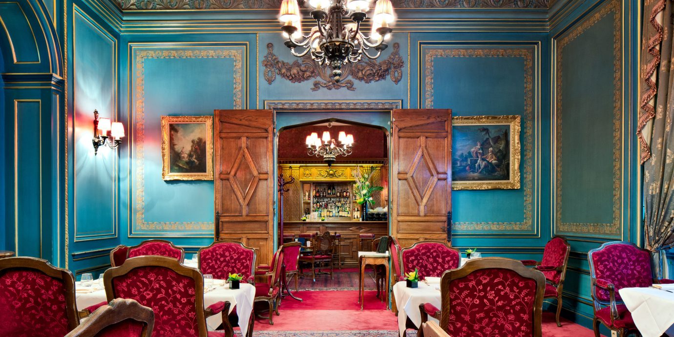
His block colour style translates well into home décor. Walls of a definite colour, solid furniture in a traditional polished wood or painted, arranged symmetrically around a centred rug. (You don’t have to go as far as inviting people to sit on the centrally placed sofa unless you are taking a photograph:-); any wall posters or paintings need to reflect the same style and be arranged accordingly.
Remember, if you style your room in this way, take the photograph ‘square-on’ for the full Wes Anderson effect.